7.5 Histogramas II
## 'data.frame':    153 obs. of  6 variables:
##  $ Ozone  : int  41 36 12 18 NA 28 23 19 8 NA ...
##  $ Solar.R: int  190 118 149 313 NA NA 299 99 19 194 ...
##  $ Wind   : num  7.4 8 12.6 11.5 14.3 14.9 8.6 13.8 20.1 8.6 ...
##  $ Temp   : int  67 72 74 62 56 66 65 59 61 69 ...
##  $ Month  : int  5 5 5 5 5 5 5 5 5 5 ...
##  $ Day    : int  1 2 3 4 5 6 7 8 9 10 ...
Nombramos a nuestro dataset e implementamos el comando para hacer un histograma:
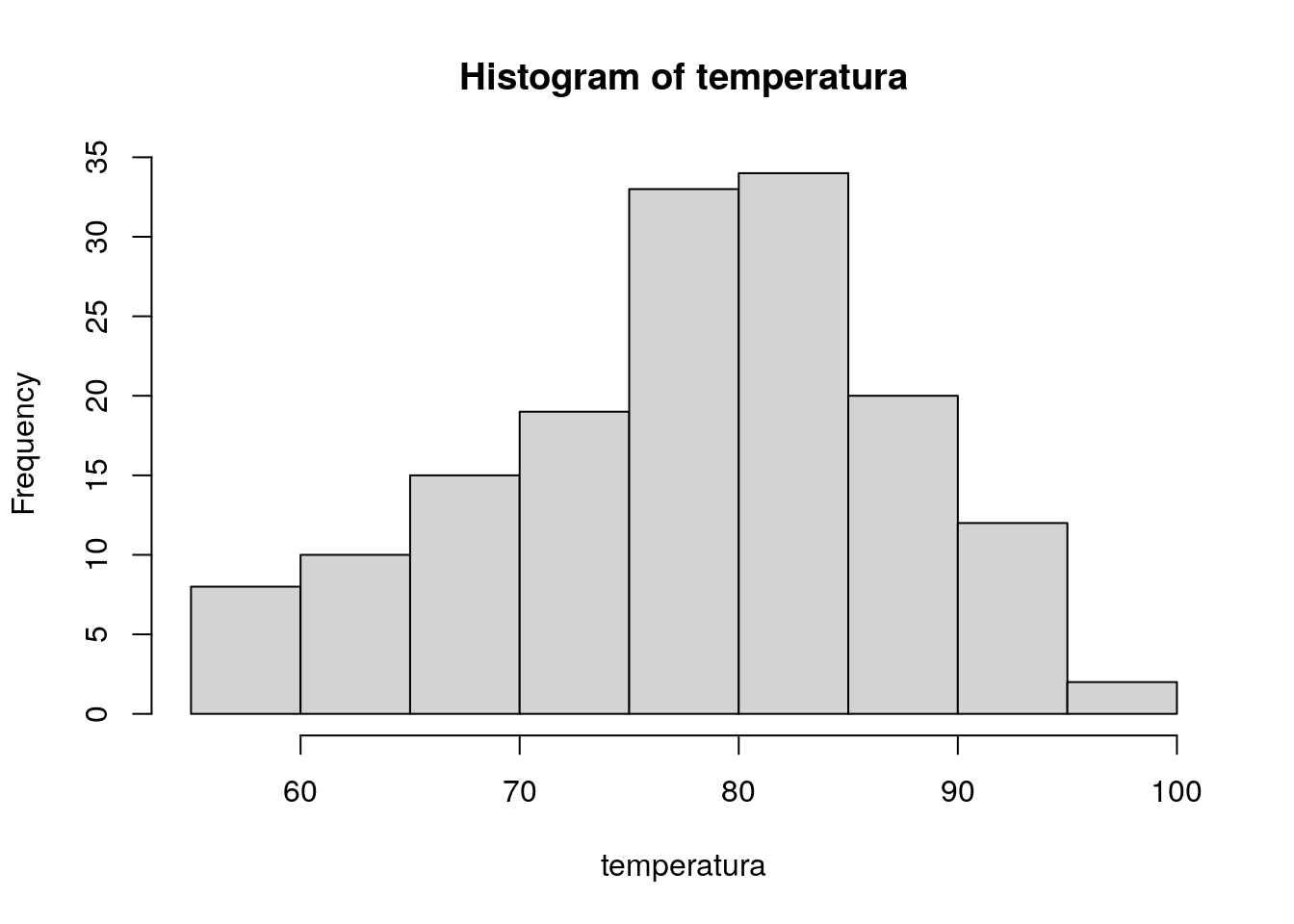
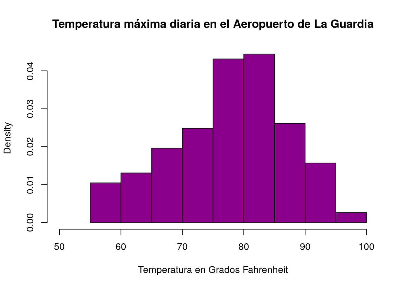
Añadimos algunos parámetros, colores y detalles a nuestro histograma:
hist(temperatura,

            main="Temperatura máxima diaria en el Aeropuerto de La Guardia",
            xlab="Temperatura en Grados Fahrenheit",
            xlim=c(50,100),
            col="darkmagenta",
            freq=FALSE
        )
# Agregar Curva normal

x <- mtcars$mpg
h<-hist(x, breaks=10, col="red", xlab="Milllas x galón",
   main="Histograma con curva Normal")
xfit<-seq(min(x),max(x),length=40)
yfit<-dnorm(xfit,mean=mean(x),sd=sd(x))
yfit <- yfit*diff(h$mids[1:2])*length(x)
lines(xfit, yfit, col="blue", lwd=2)
# Kernel Density Plot
d <- density(mtcars$mpg) # returns the density data
plot(d) # plots the results
# Compare MPG distributions for cars with
# 4,6, or 8 cylinders
library(sm)
attach(mtcars)
# create value labels
cyl.f <- factor(cyl, levels= c(4,6,8),
labels = c("4 cylinder", "6 cylinder", "8 cylinder"))
# plot densities
sm.density.compare(mpg, cyl, xlab="Miles Per Gallon")
title(main="MPG Distribution by Car Cylinders")
# add legend via mouse click
colfill<-c(2:(2+length(levels(cyl.f))))
legend(locator(1), levels(cyl.f), fill=colfill)